More than eighty percent of American internet users now browse on smartphones rather than desktop computers. As mobile searches reshape how people find brands online, falling behind in Mobile SEO means missed opportunities for any business. Whether you run a local shop or a nationwide company, understanding why mobile optimization matters helps you reach the American audience where they spend most of their online time and avoid losing your visibility in search results.
Table of Contents
- What Is Mobile SEO and Why It Matters
- Responsive Design vs. Separate Mobile Sites
- Mobile-First Indexing and Google Priorities
- Critical Ranking Factors for Mobile Search
- Common Mobile SEO Mistakes to Avoid
Key Takeaways
| Point | Details |
|---|---|
| Mobile SEO Importance | Mobile SEO is essential for optimal website performance on mobile devices, affecting search visibility and user engagement. |
| Responsive Design vs. Separate Sites | Responsive design is favored for its ability to provide consistent user experiences across devices without needing multiple site versions. |
| Mobile-First Indexing | With mobile-first indexing, Google prioritizes mobile experiences, making robust mobile optimization critical for search rankings. |
| Common SEO Pitfalls | Avoid common mistakes like slow loading speeds and non-responsive designs to ensure effective mobile optimization and improved search performance. |
What Is Mobile SEO and Why It Matters
In the fast-evolving digital landscape, Mobile SEO represents a critical strategy for ensuring websites perform optimally on smartphones and tablets. Local SEO strategies have transformed from optional tactics to mandatory requirements as mobile internet usage continues to surge worldwide. The primary goal of Mobile SEO is to create seamless, responsive experiences that satisfy both user expectations and search engine algorithms.
Search engines like Google now prioritize mobile-friendly websites, which means your digital presence must adapt or risk becoming invisible. Mobile optimization involves multiple technical and content-related factors that determine how effectively your website performs on mobile devices. These include page load speed, responsive design, mobile-friendly navigation, and content readability on smaller screens.
Research confirms the critical importance of mobile optimization. According to recent studies, websites with robust mobile experiences see significant improvements in search rankings and user engagement. Key elements that define successful Mobile SEO include:
- Responsive website design that adjusts to different screen sizes
- Fast loading times under 3 seconds
- Easy-to-read text without requiring zoom
- Touch-friendly navigation elements
- Compressed images and minimal server requests
By understanding and implementing these principles, businesses can dramatically improve their online visibility and connect more effectively with mobile users searching for their products or services.
Responsive Design vs. Separate Mobile Sites
Responsive design and separate mobile sites represent two distinct approaches to mobile optimization, each with unique advantages and challenges. Web design strategies have evolved significantly, pushing businesses to carefully consider which approach best suits their digital ecosystem.

Responsive web design offers a unified solution that adapts content dynamically across different screen sizes and devices. By utilizing a single codebase, responsive websites automatically adjust layout, images, and functionality to provide an optimal viewing experience. This approach eliminates the need for multiple website versions and ensures consistent branding and user experience across smartphones, tablets, and desktop computers.
Conversely, separate mobile sites maintain distinct versions for different devices, each with its own unique domain and tailored content. While this approach allows for more precise device-specific optimization, it also introduces complex management challenges. Here’s a comparative breakdown:
Responsive Design Pros:
- Single website management
- Consistent user experience
- Lower development costs
- Easier SEO maintenance
- Faster content updates
Separate Mobile Site Pros:
- Device-specific performance optimization
- Customized user interfaces
- Potential for faster loading on mobile
- More granular content control
- Targeted mobile experiences
Ultimately, the choice between responsive design and separate mobile sites depends on specific business requirements, technical capabilities, and user engagement goals. Modern web development increasingly favors responsive design for its flexibility and comprehensive approach to multi-device accessibility.
Mobile-First Indexing and Google Priorities
Mobile-first indexing represents a fundamental shift in how search engines evaluate and rank websites, prioritizing mobile experience over traditional desktop performance. Technical SEO strategies have dramatically transformed to accommodate this crucial change in search engine algorithms.
Google’s approach fundamentally reimagines web content evaluation by using the mobile version of a website as the primary source for indexing and ranking. This means that websites without robust mobile optimization will experience significant disadvantages in search results. SEO techniques now require a mobile-centric approach that goes beyond simple responsive design.
Key priorities for mobile-first indexing include:
- Consistent content across mobile and desktop versions
- Fast page loading speeds on mobile devices
- Mobile-friendly navigation and user interface
- Readable text without requiring zooming
- Touch-friendly interactive elements
- Compressed images and minimal resource consumption
Websites that successfully implement mobile-first design principles gain significant advantages. Organizations with mobile-responsive websites experience improved search rankings, enhanced user engagement, and better overall digital performance. The mobile experience is no longer an optional enhancement but a critical component of digital strategy that directly impacts online visibility and user interaction.
Critical Ranking Factors for Mobile Search
Mobile search rankings demand a sophisticated approach that goes far beyond traditional website optimization. SEO ranking factors now prioritize mobile-specific performance metrics that directly impact user experience and search visibility.
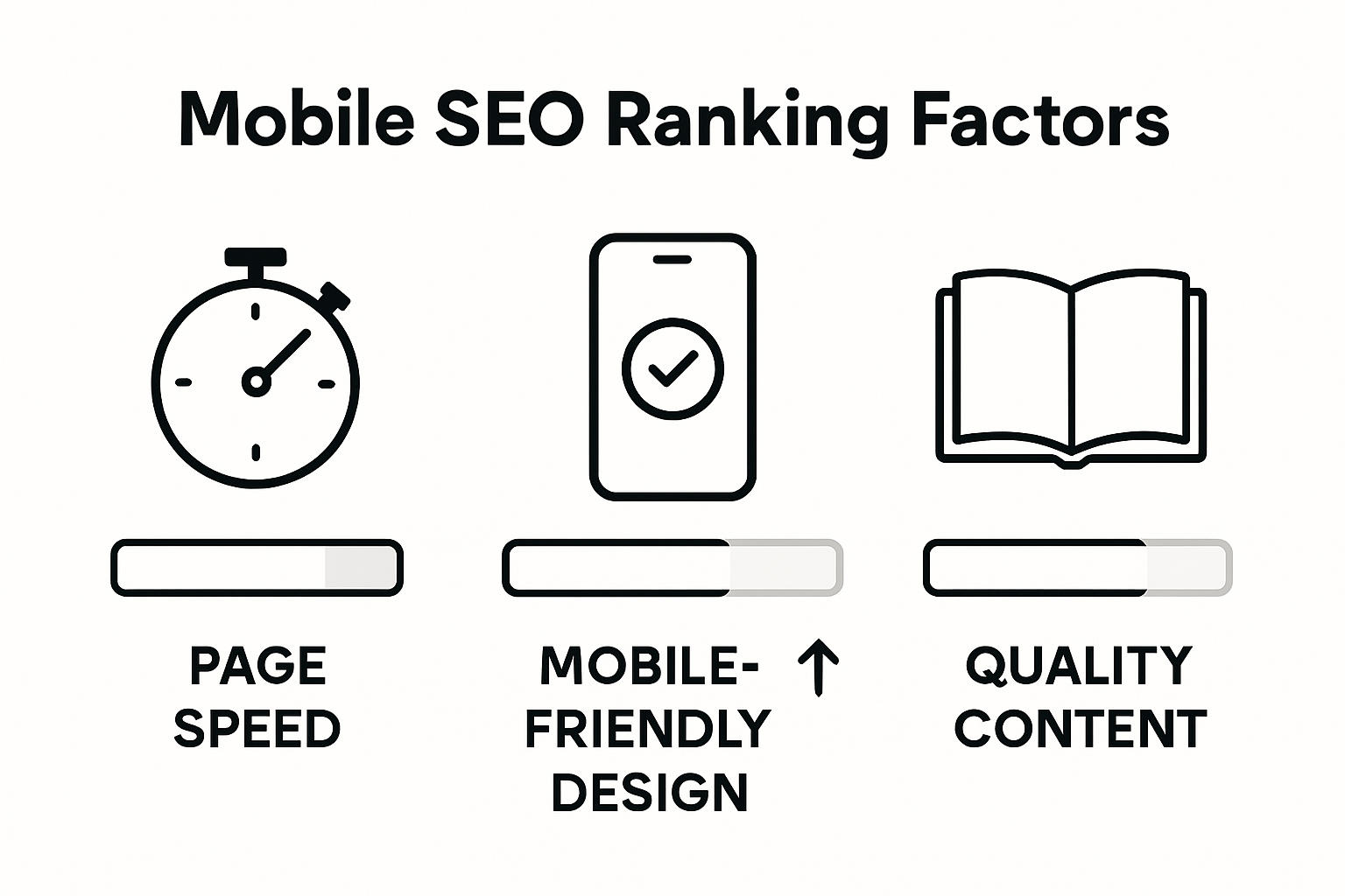
The most crucial ranking factors for mobile search include page speed, mobile responsiveness, and content accessibility. Websites must deliver lightning-fast loading times, with research indicating that even a one-second delay can significantly reduce user engagement and search rankings. User experience design has become paramount, requiring websites to create seamless, intuitive interfaces that work perfectly across various mobile devices.
Key mobile search ranking considerations include:
- Page load speed under 3 seconds
- Fully responsive design
- Mobile-friendly navigation
- Readable text without zooming
- Compressed and optimized images
- Touch-friendly interactive elements
- Minimal use of intrusive pop-ups
- Accurate local business information
- Structured data markup
- Secure HTTPS connection
Successful mobile optimization requires a holistic approach that balances technical performance with engaging content. Websites that prioritize mobile user experience will not only improve their search rankings but also create more meaningful connections with their audience across different devices and platforms.
Common Mobile SEO Mistakes to Avoid
Mobile optimization requires precision and strategic thinking to avoid critical errors that can devastate search rankings. Technical SEO strategies provide crucial insights into preventing common pitfalls that undermine mobile website performance.
One of the most significant mistakes is neglecting responsive design principles. SEO tactics emphasize the importance of creating a unified website experience that adapts seamlessly across different devices. Maintaining separate mobile sites can lead to inconsistent content, increased maintenance challenges, and fragmented user experiences that search engines penalize.
Critical mobile SEO mistakes to avoid include:
- Slow page loading speeds
- Non-responsive design
- Uncompressed images
- Intrusive pop-ups
- Unreadable text on mobile screens
- Complex navigation menus
- Missing structured data markup
- Inconsistent content between desktop and mobile versions
- Lack of mobile-friendly touch elements
- Ignoring local SEO optimization
Successful mobile SEO demands a holistic approach that prioritizes user experience, technical performance, and consistent content delivery. Websites must continuously adapt and optimize their mobile strategies to remain competitive in an increasingly mobile-first digital landscape.
Elevate Your Mobile SEO Strategy Today
Struggling with slow loading times or non-responsive designs can keep your website buried in search results despite your best efforts. The article reveals how crucial mobile-first indexing and seamless mobile experiences are for boosting your search rankings and reaching more customers. If you want to overcome challenges like unreadable text on small screens or poorly optimized navigation, mastering these mobile SEO essentials is key for your digital success.
Explore expert insights and tools that make improving your mobile website both simple and effective. Explore our SEO tools designed to optimize page speed and responsiveness. Enhance your content with smart copywriting techniques by visiting our Copywriting section to ensure your message connects powerfully on every device. Take the first step in evolving your mobile SEO with proven strategies only at wordsatscale.com.

Don’t let outdated mobile designs hold your website back. Join thousands of marketers and site owners transforming their mobile SEO and driving more targeted traffic. Visit wordsatscale.com and start optimizing your mobile presence now before your competitors take the lead.
Frequently Asked Questions
What is Mobile SEO?
Mobile SEO refers to the strategies used to optimize a website for mobile devices such as smartphones and tablets, focusing on aspects like page load speed, responsive design, and mobile-friendly navigation to improve search rankings and user experience.
Why is Mobile SEO important for my website?
Mobile SEO is crucial because search engines like Google prioritize mobile-friendly websites in their rankings. With increasing mobile internet usage, an optimized mobile site can lead to better visibility, higher search rankings, and improved user engagement.
What are the key elements of effective Mobile SEO?
Key elements of effective Mobile SEO include responsive design, fast load times (under 3 seconds), easy-to-read text without zooming, touch-friendly navigation, and optimized images to enhance the mobile user experience.
How does mobile-first indexing affect my website’s SEO?
Mobile-first indexing means that Google uses the mobile version of your website as the primary source for ranking and indexing. If your site is not optimized for mobile, it may suffer in search engine rankings, making it essential to prioritize a cohesive mobile experience.